ComboStrap Styling - Color
About
Every ComboStrap UI component can be colorized with one of the following color attributes
- text-color : The color of the text
- background-color : The color of the background
- border-color : The color of the border
This page describes which color value, they can take.
Example
- A card with:
- a black (text) color
- a teal background color
- a blue border color
<card color="black" background-color="teal" border-color="blue" align="center" width="200px">
A teal [[docs:block:card|card]] with a black text and a blue border
</card>
- Output:
A teal card with a black text and a blue border
Value
ComboStrap supports the following color value:
- reset (to take the color of the parent)
Generating or choosing attractive color is not easy. The color generator page may help you in this task.
Name
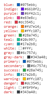
ComboStrap follows the Bootstrap color naming and you may then use the following color names.
You can set the branding colors primary and secondary in the configuration.
The default Bootstrap colors are:
You can also use a CSS Color name.
Rgb
rbg (or red blue green) is the standard web value that is composed of an hexadecimal value.
Example with the text component
<text color="#6c757d" width="fit" align="center">
Text color with a hexadecimal value of ''#6c757d''
</text>
- Output
Text color with a hexadecimal value of #6c757d
Reset
The reset color applied on a link will take the color of the text and we underline it to make it visible.
- Input
<text color="#6c757d">
Colored text with a [[?color=reset&underline|reset link]]
</text>
- Output
Colored text with a reset link
