About
A card is a box with the dimension of a card that contains summary data such as:
- a heading
- a short description
- with an optional image illustration
If the body contains call-to-actions, this is called a teaser
Example
A Full Card (image, title, content, button styled)
<card width="18rem">
{{:teaser_image_1.png|}}
=== Teaser Title  ===
A example taken from [[https://getbootstrap.com/docs/4.3/components/card/#example|the bootstrap quick example]] on how to build a card title in order to make up the bulk of the teaser content.

<btn>[[:start|Go to the best plugin on the universe !]]</btn>
</card>
A example taken from the bootstrap quick example on how to build a card title in order to make up the bulk of the teaser content.
Teaser is an alias for card.
At first, teaser was the first name of card and you may still use it.
<teaser width="20rem">
{{:teaser_image_2.jpg|}}
=== Teaser Title  ===
A example taken from [[https://getbootstrap.com/docs/4.3/components/card/#example|the bootstrap quick example]] on how to build a card title in order to make up the bulk of the teaser content.

<btn link spacing="pl-0">[[:docs:block:card|Card link]]</btn>
<btn link >[[#|Another link]]</btn>
</teaser>
A example taken from the bootstrap quick example on how to build a card title in order to make up the bulk of the teaser content.
Note that the images by default stretch into the whole available card space. The image above is too small for the card and is therefore scaled up.
A card may include other dokuwiki syntax
Card may include other component. Example with related
<teaser width="18rem">
=== Backlinks in Card ===
This pages are talking about this subject:
<related/>
</teaser>
This pages are talking about this subject:
A card may be styled
Because a card is a HTML superset component, you can style it as you wish.
<card width="300px" background-color="dark" color="white" align="center" >
<header>Header is the top of a component</header>
=== A styled card ===
You can style all [[:docs:marki|HTML superset component]] easily.

A [[:docs:styling:align|centered box]] with a dark background [[:docs:styling:color|color]] and a white text.

<btn light>
[[:docs:styling:styling|Check it out !]]
</btn>
</card>
You can style all HTML superset component easily.
A centered box with a dark background color and a white text.
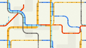
A card may be clickable
You may extend the clickable surface of a link to the whole card with the clickable attribute.
<card width="18rem" clickable="true">
{{:docs:styling:subway_card_tile.png|}}
=== Clickable Card ===
Lorem ipsum

<btn>[[https://combostrap.com/clickable|A clickable card]]</btn>
</card>
A card in a iterator fragment
A card can be used in a iterator fragment with the page-image component as illustration.
Example for the last 4 modified page
<iterator>
    <data>select order by date_modified desc limit 3</data>
    <grid max-line=3 gutter="x-4">
        <fragment>
          <box>
             <card clickable>
                <page-image ratio="16:9"/>
                === $h1 ===
                ${description|head(100,'...')} [[$path| ]]
             </card>
          </box>
        </fragment>
    </grid>
</iterator>


Syntax
<card attribute>
    illustration
    <header>Label</header>
    Content
    <btn>[[link|button]]</btn>
</card>
where:
- attributes may be any styling attributes
- such as clickable to make the whole card clickable.
- illustration may be:
- an image link (by default, the ratio is 16:9)
- or a page-image (used in a template)
- header defines a label placed at the top of the card
A card:
- is a superset HTML component and permits then all kind of styling
- can be laid out in tile with the card-columns component
A blockquote is also logically a card that happens to have an external quote in its body.