About
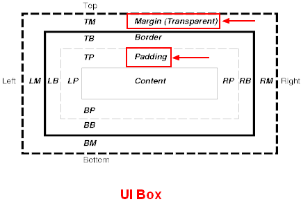
spacing is the definition of the margin and padding between block component
where:
- margin is a transparent space outside the box (not filled with the background color)
- padding is the space inside the box (filled with the background color)
If you want to add space between lines, used the text component and its line-spacing attribute
Example
Padding and Spacing on all sides
A note with:
- p-3: a padding with a scale value of 3 (blue color)
- m-5: a margin with a scale value of 5 (no color)
<note spacing="p-3 m-5">
A note with a padding and a margin
</note>
A note with a padding and a margin
Padding and Spacing on the start side
The start side is:
- left for LTR language.
- right for RTL language
A note with:
- ps-3 means:
- p: a padding (painted in blue)
- s: at the start of the line (ie left in english)
- -3: with a scale value of 3
- ms-5 means:
- m: a margin (no color - transparent)
- s: at the start of the line (ie left in english)
- -5 with a scale value of 5
<note spacing="ps-3 ms-5">
A note with a padding and a margin only at the start of the line (ie ''left'' in english) - not at the right
</note>
A note with a padding and a margin only at the start of the line (ie left in english) - not at the right
Syntax
<component spacing="value" />
where value is:
{spaceType}[sides]-{size}
where:
- spaceType (mandatory) is the type of space
- p for padding
- m for margin
- sides (optional default to all sides) is
- axis:
- x (Left and right)
- y (top & bottom)
- position:
- s: start (left for LTR or right for RTL language)
- e: end (right for LTR or left for RTL language)
- t: top
- b: bottom
- size (mandatory) is 0,1,2,3,4 or 5 (based on size scale)
This value may be conditioned to the screen size by adding a breakpoint as prefix
Example: a padding of 3 applied from a medium screen size
<component spacing="p-3-md" />
Support
Bootstrap 4 Notation Preserved
The l and r for left and right of Bootstrap 4 are translated to start and end
<note spacing="pl-3 ml-5">
The old notation ''l'' and ''r'' are still supported therefore ''pl-3 ml-5'' is equivalent to  ''ps-3 ms-5''
</note>
The old notation l and r are still supported therefore pl-3 ml-5 is equivalent to ps-3 ms-5
