Branding Colors (primary, secondary)
About
branding colors are a set of principal colors that determines your brand visually.
They should be the most used colors in your theme.
In ComboStrap, they are called:
- primary
- secondary
The primary color is the color
- displayed most frequently with the most importance
- that should have the most lightness and saturation
The secondary color :
- is the second color in importance
- is used to give another color accent if your theme is dual-tone.
- is darker and mostly used in the text (This is the default color of icon for instance)
Usage
They are:
- used as the default colors in the following components:
- icon,
- advertised in the app manifest
Color Name Precedence
When the color are set, they will take precedence:
- as color name
- and as color type.
For instance, a button:
- that has the primary type has default
- will take the primary color of this installation (ie #7611F7)
<btn>[[#|A button with the default primary color]]</btn>
- Output:
Branding Color Inheritance
The branding color inheritance is a feature that will apply automatically the primary color to the following component.
You can disable this feature in the configuration.
For SEO purpose, we make sure that the contrast ratio is enough for best readability (if not, we change it to go above the minimum of 4.5 1)
Configuration
Colors
You can set the brand colors in the configuration with the primary-color and secondary-color property.
Disable the branding color inheritance
You can disable the inheritance of the branding colors with the brandingColorInheritanceEnable configuration. The color of the bootstrap stylesheet will then take over.
Example
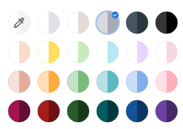
The image below shows as example a list of primary/secondary colors that are the basic block for a theme.
This list of colors is used by Chrome to choose your theme for your profile (chrome://settings/manageProfile)
