About
shadow (known also as elevation) is a styling attribute that elevates a block.
It adds a shadow and gives the block more emphasis.
As color, it helps prioritizing the components on your page in order to guide the viewer's eyes.
It's mostly used on a call-to-action component such as a button.
Syntax
To add a shadow, you can use the shadow attribute or its alias elevation.
elevation="sm|md|lg|1"
shadow="sm|md|lg|1"
where the value of the attribute sets the scale height of the elevation
| Value | OnHover Animation Name | Name |
|---|---|---|
| sm | shadow-sm | Small |
| md | shadow-md | Medium |
| lg | shadow-lg | Large |
| xl | shadow-xl | Extra-Large |
| true, 1 | shadow | Default |
The OnHover animation name is the name that can be used to apply a shadow when the mouse is over an element . See the example
Elevation since version 1.12, Shadow since version 1.14
Example
Button
With a button
<btn>
Flat
</btn>
<btn shadow="sm">
Small Shadow
</btn>
<btn shadow="md">
Medium Shadow
</btn>
<btn primary shadow>
Default Shadow
</btn>
<btn shadow="lg">
Large Shadow
</btn>
<btn shadow="xl">
Extra-Large Shadow
</btn>
Card
With a card
<card shadow="xl" width="200px">
===== Elevated card =====
Guide on how to elevate
</card>
Guide on how to elevate
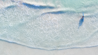
Image
<box shadow="lg" width="fit-content" align="center">
   {{:docs:block:stock_image_surfer_in_the_see.png?400|}}
</box>
On Hover
You can also apply a shadow on hover with the shadow animation name
Example with a large shadow.
<box onHover="shadow-lg" width="fit-content" align="center">
    {{:docs:styling:subway_card_tile.png|}}
</box>
Configuration
default
You can change the default level of shadow with the defaultShadowLevel configuration.

