About
A carrousel is a layout component where the user can cycle through elements in a horizontal way.
To cycle through the elements, you can use:
- on a mobile, the swipe hand gesture
- on a desktop, the mouse or the arrow and bullet control elements.
Because a carrousel is also known as a slideshow, the elements of a carrousel are generally called slides.
Example
Image Gallery
This example shows you a carrousel of image known also as a image gallery.
- The cards:
<carrousel>
{{ :woman-yoga-sunset.jpg?0x600 |}}
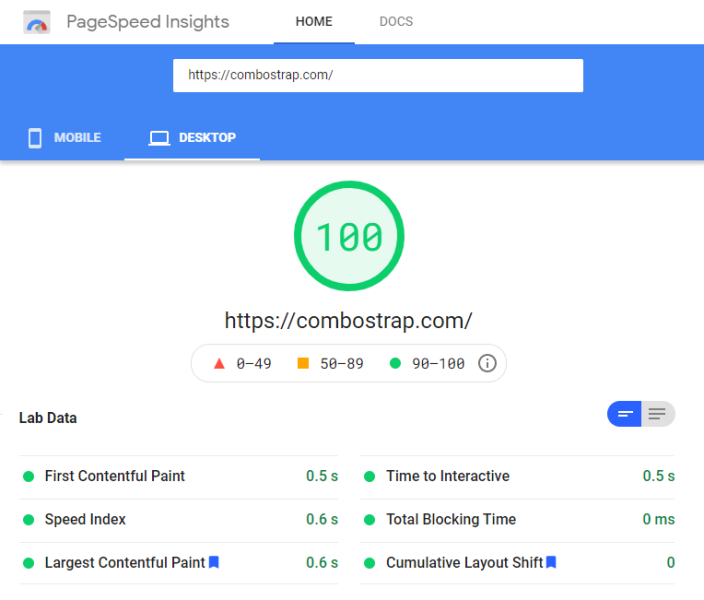
{{ :page_speed_performance.png?0x600 |}}
{{ :undraw_content_creator.svg?0x600 |}}
</carrousel>
- The output:
Carrousel dynamically created with the iterator
With the template iterator, you can create dynamically the children that you want to show.
Example with all pages that are in the layout path.
- The iterator with the data node that uses the page sql to select the pages
<iterator>
    <data>select where path like "%layout%" order by title asc limit 10</data>

    <heading h4 align="text-center" spacing="mb-3"> The pages talking about layout in ComboStrap </heading>
    <carrousel element-width="250px">
        <fragment>
            <card clickable>
            <page-image path="$path" ratio="16:9"/>
            == $title ==
            <itext color="muted">${date_modified | format("eeee dd-MM KK:mm")}</itext>

            ${description" | head(200,"...")} [[$path| ]]
            </card>
        </fragment>
    </carrousel>
</iterator>
- The output:

Minimum Elements Count
If the number of elements is not enough to feel the screen, the default behavior of the carrousel is to repeat them.
The elements-min attribute permits to disable this feature and to replace the carrousel by a grid if the minimum element count is not met. By default, the value is 3.
This feature is most used with an iterator where the number of element is not known in advance but for the purpose if this demonstration we are using 2 fix cards.
<carrousel element-width="250px" elements-min="3">
<card>
{{:logo.svg?ratio=21:9|}}
=== First Card ===
Lorem ipsum dolor sit amet, consectetur adipiscing elit, sed do eiusmod tempor
incididunt ut labore et dolore magna aliqua. Ut enim ad minim veniam, quis nostrud
exercitation ullamco laboris nisi ut aliquip ex ea commodo consequat.
</card>
<card>
{{:logo.svg?ratio=21:9|}}
=== Second Card ===
Lorem ipsum dolor sit amet, consectetur adipiscing elit, sed do eiusmod tempor
incididunt ut labore et dolore magna aliqua. Ut enim ad minim veniam, quis nostrud
exercitation ullamco laboris nisi ut aliquip ex ea commodo consequat.
</card>
</carrousel>
- The output is a centered grid.
Lorem ipsum dolor sit amet, consectetur adipiscing elit, sed do eiusmod tempor incididunt ut labore et dolore magna aliqua. Ut enim ad minim veniam, quis nostrud exercitation ullamco laboris nisi ut aliquip ex ea commodo consequat.
Lorem ipsum dolor sit amet, consectetur adipiscing elit, sed do eiusmod tempor incididunt ut labore et dolore magna aliqua. Ut enim ad minim veniam, quis nostrud exercitation ullamco laboris nisi ut aliquip ex ea commodo consequat.
Syntax
<carrousel
   element-width="..."
   elements-min="..."
   control="all|none"
>
</carrousel>
where:
- element-width is the minimum width of an element on the screen. By default, this is 100% (meaning that there is only one element, ie a gallery)
- elements-min is the minimum of elements needed to show a carrousel. By default: 3. If this threshold is not met, a grid is instead used.
- control manages the control elements. If none, no arrow buttons or bullets are shown.
A gallery for Combostrap is a carrousel that shows only one element at a time. This is the default mode (ie when the element-width attribute is unset).
- In this mode:
- the arrow buttons are the only controls visible on mobile
- there is always one element in view
- In other mode (when there is more than one element on the screen)
- there is no control visible on mobile
- the number of elements shown is a plain number and a half (to show that this is serie of element)
Support
Lazy Loading
Lazy loading works on modern browser where the loading attribute is supported.


