ComboStrap UI - Icon Component
About
icon is a component that permits to add easily an svg icon such as this one: :
- from an icon library
- or from your media library as a SVG media file
Example
Material Design Icon
Example with the arrow-down-circle
- The default secondary color is used by default
<icon name="arrow-down-circle" />
- The default primary color is used for icon bigger than 36
<icon name="arrow-down-circle" width="60"/>
Bootstrap
Example with the arrow-down-circle-fill and a blue color
<icon name="bootstrap:arrow-down-circle-fill" color="blue" width="48px" />
Feather
Example with a box icon and a color
<icon name="fe:box" color="blue" width="48px" height="48px" />
Zoom out - Illustrative Icon
In case of an illustrative icon used for instance in a card or as page image, the icon may be zoomed out (by default, the value is 4)
Example of icon zoomed out by a factor of 3.
<icon name="fe:box" color="skyblue" width="200" height="200" zoom=-3 border-color="skyblue" />
Multiple Colors
We support multiple colors icons.
- For instance, with the flat-color-icons:smartphone-tablet icon
<icon name="flat-color-icons:smartphone-tablet" width="100" />
- If a color is set, we change the first color found.
<icon name="flat-color-icons:smartphone-tablet" color="skyblue" width="200" zoom=-3 border-color="skyblue" />
Syntax
An icon can be seen as a character and is therefore a component that can be used in a line.
The syntax is:
<icon name="[library:]icon-name" color="color" width="width" zoom="factor"/>
where:
- name is the full qualified Iconify search engine name where:
- library is the optional name of a supported icon library (if not set, the default is used)
- icon-name is the name of the icon
- color is the color value. By default:
- the secondary color (if the icon width is less than 36 px)
- the |primary color otherwise.
- width is the width value
- zoom is a zoom factor (zoom in when the factor is positive, zoom out otherwise). A zoom is performed after a crop.
How to show an icon ?
To show a icon:
- Go to the Iconify search engine,
- Search an icon
- Verify that we support the library (if the library is not supported, see the next paragraph)
- Copy the Iconify full qualified name
- And use it with the icon syntax.
How to show any icons ?
If the library is not yet supported, you can also easily embedded it.
You just need to follow this steps:
- go to your icon repository
- download your icon
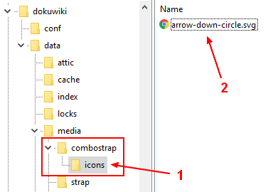
- upload it to your media library (preferably under the directory combostrap:icons)
- use it:
- with the icon syntax (if saved under the directory combostrap:icons)
- with the svg syntax with a value of icon for the type attribute
Example with Google icon and the favorite icon saved in the media library in the namespace combostrap:icons:google
- with the svg syntax
{{:combostrap:icons:google:favorite_black_24dp.svg?36&type=icon&color=steelblue|}}
- with the icon syntax (if you saved it under the directory combostrap:icons)
<icon name="google:favorite_black_24dp" width="36" color="purple"/>
Properties
Color
In the color attribute, you can set a color value.
ComboStrap detects automatically if the icon is a solid or outline one and sets the color accordingly.
Example with the bootstrap alarm clock
<icon name="bs:alarm" color="pink" />
<icon name="bs:alarm-fill" color="pink" />
Sizing: Width and Height
The width and height attributes have the same value and takes the default value of 24px but you can overwrite it.
<icon name="logo.svg" width="96px" />
Styling and Native Attribute
The icon component supports also :
- all SVG attributes (svg attributes)
Example:
- with a hover animation
<icon name="bs:alarm-fill" color="pink" onHover="grow" width="36"/>
Library
The icon component supports the below libraries natively.
The acronym should be used as library name. It follows the acronyn found in the iconify search engine
| Name | Acronym | WebSite |
|---|---|---|
| ant-design | ant-design | Ant design |
| akar-icons | akar-icons | akaricons (MIT) |
| arcticons | arcticons | https://arcticons.com/ (CC BY-SA 4.0) |
| bootstrap | bi | Bootstrap icon |
| boxicons | bx | Boxicons (CC BY 4.0) |
| carbon | carbon | Carbon (IBM) |
| clarity | clarity | Clarity icon (essential) |
| codicon | codicon | Microsoft Code Icon |
| core ui brand | cib | Core Ui Icons |
| dashicons | dashicons | Wordpress dashicons |
| elegant theme | et | Elegant Themes |
| eva | eva | Eva Icons |
| fad | fad | Fad (Font Audio Icons) |
| flat color button | flat-color-icons | Icons8 (MIT) |
| font awesome brands | fa-brands | Font Awesome (CC BY 4.0) |
| font awesome regular | fa-regular | Font Awesome (CC BY 4.0) |
| font awesome solid | fa-solid | Font Awesome (CC BY 4.0) |
| feather | fe | Feather |
| healthicons | healthicons | Healthicons (MIT) |
| icomoon | icomoon-free | Icomoon |
| iconoir | iconoir | Iconoir |
| iconscout | uit | Iconscout (Line only) |
| line awesome | la | Line Awesome (MIT) |
| logos | logos | SvgPorn |
| material-design | mdi | Material design icon |
| octicon | octicon | Github Octicons |
| phosphor icon | ph | Phosphor Icons |
| simple line | simple-line-icons | Simple Line Icons |
| si glyph | si-glyph | Si Glyph by Smarticons (CC BY SA 4.0) |
| twemoji | twemoji | Twitter Emoji |
| vaadin | vaadin | Vaadin Icons |
| vscode | vscode-icons | VsCode Icons (MIT) |
The default library is material-design but you can change this configuration.
You can also download an icon from your preferred icon library and use it directly.
Configuration
Icons namespace
When the icon does not exist, the component downloads the icons in the namespace set in the icons_namespace configuration.
The default value is :combostrap:icons
On the server, the namespace is a location from the media directory: DOKUWIKI_HOME/data/media/
Default Library
You can change the default library with the defaultIconLibrary configuration.
At installation time, the default library is material design.
Icon Vs Svg
An icon is just a svg that is seen as a character.
ComboStrap sets the following properties on a icon by default:
- width and height have the same value (default to 24px)
- color: currentColor by default
- not responsive (no preserveAspectRatio and no max length CSS properties)
- no alignment (ie no left, center or right)
As an icon is just a svg, you can also use the svg syntax directly against a custom svg to embed it as an icon.
Example:
{{:custom-icon.svg?16&type=icon|}}
Support
Prerequisite
This component uses the DOM module. This module is enabled by default on all hosting platform. It should be then no problem for most of your installation.
What to do if my icon does not render correctly ?
If your icon comes from a supported library and does not render correctly, contact us or create an issue
Otherwise, check this answer
Why downloading the image and not using a library
We are not using a library and have decided to download the svg file for the following reasons:
- the icon can then be used as
- even if the library does not exist anymore, your page will still show the icon.