
About
hover animation permits to add animations to your block component when the mouse points an element (ie is hover).
Syntax
To add an hover animation, add a onHover attribute with the name of your animation.
<blockComponent onHover="animationName animationName ..."></blockComponent>
Animation
Float
When you want to add dynamic elevation, you can use the float animation
- On a button
<button onHover="float">A floated animated button</button>
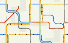
- On an image
{{:docs:styling:subway_card_tile.png?onHover=float|}}
Grow
When you want to add a zoom-in effect, you can use the grow animation
<button onHover="grow">A zoom-in / grow animated button</button>
A zoom-in / grow animated icon - <icon width="50px" height="50px" onHover="grow" name="logo.svg" />
A zoom-in / grow animated icon -
Shadow
You can use the shadow animation name to add a shadow on hover.
<card onHover="shadow-lg" width="300px" height="150px">A animated card with a shadow</card>
A animated card with a shadow
Combination
Float Shadow
You can combine the effects, example with float and a shadow
<card onHover="float shadow" width="300px" height="150px">A combo float shadow animated card</card>
A combo float shadow animated card
Beware that if you replace the space by a minus, you get the float-shadow hover.css effect.
<card onHover="float-shadow" width="300px" height="150px">A hover.css float-shadow animated card</card>
A hover.css float-shadow animated card
Hover.css
You can also use Hover.css animation.
We support the hover.cssnaming standard.
Example: a button with an underline animated from left
<button link onHover="underline-from-left" >A hover underline from left animated button</button>
The library is not primary supported because:
- there is some incompatibility with BootStrap
- they require a commercial license if not for personal use.
If you underline problems, you can also add your own.
Custom
Custom: Bootstrap Class
If the animation name is not found, the name is applied as a class. You can then used all Bootstrap utility class to create an hover effect.
Example from an normal button to a bigger one with the btn-lg Bootstrap button class where lg means a larger button
<button info onHover="btn-lg" align="center">
A button animated with default Bootstrap class
</button>
Custom: Bring it to Combostrap
The hover animation applies the name of the animation as a class to the component when the mouse is hover it.
If you want to bring your animation to ComboStrap:
- create a CSS class rule to apply on hover. Example: A darken animation:
.darken {
      opacity: 0.5;
}
- clone the combo repository
git clone https://github.com/ComboStrap/combo
- add the CSS rule to the onhover.css stylesheet
- and apply a pull request.
Custom: UserStyle
If you want to create an animation for yourself, add the CSS class rules in the onhover component stylesheet
Example with the fade like background transition of hover.css.
- The CSS
button.animated:hover {
    background-color: #FFF;
    color: #2098D1;
    transition-duration: 0.4s;
    transition-property: color, background-color;
}
- In your page
<button class="animated">
A button animated with a fade background transition
</button>
- Result: