About
raster images are images that are defined as a matrix of pixel (as opposed to vectorial image such as svg that are defined as geometric shape).
jpeg, png, bmp, gif are all examples of raster images.
Syntax
ComboStrap follows the general image syntax where you can set:
- the dimension (width, height, ratio)
- the alignement (left, center, right float)
- and all styling attributes
Rules:
- By default, we don't allow a raster image to expand beyond its dimensions. For instance, if an image is 300px wide, and that you asks to render it with a 400px width, we will send a warning message that this is not possible.
- For illustrative purpose, such as in a card image or background, the image will expand.
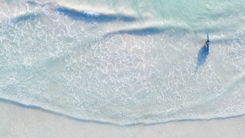
Example
Illustration
For instance:
- an elevated photography with a surfer
- an opacity of 0.5
- centered (one space at the beginning, one space at the end)
- with a width of 600 pixel
- with rounded borders thanks to the rounded class of Bootstrap
- responsive and mobile ready (below 600, the image scales down).
{{ :docs:block:stock_image_surfer_in_the_see.png?600&shadow=md&onhover=float&opacity=0.5&class=rounded |}}
Icon
- Syntax
A raster image can also be used as icon {{:docs:block:code-square.png?16&nolink|}}
- Output:
A raster image can also be used as icon 
Avatar
Thanks to the utility class of bootstrap, your can apply the borders class to create an avatar image.
Example:
{{:nico_gravatar.jpeg?70&class=rounded-circle|}}
Features
Lazy loading
By default, the raster image are lazy loaded meaning that they are downloaded only when they are on the screen or going to be visible on the screen.
You can disable this feature with the rasterimagelazyloadingenable configuration.
Automatic Responsive Resizing
Automatic Responsive Resizing aims to send the image that suits the sizing of the browser.
We detect if the user is on a mobile or a desktop and download the image at the lowest needed resolution.
The loaded image resolution is based on the screen size and pixel resolution with breakpoints at:
| Breakpoint | Max-Width | Description |
|---|---|---|
| Extra-Small | <= 375 | Portrait phones |
| Small | <= 576 | Landscape phones |
| Medium | <= 768 | Tablets |
| Large | <=992 | Desktops |
| Extra-Large \ >=992 | Large Desktops |
The below video shows you a demonstration of responsive lazy loading of this page. When we are scrolling, just before the image that has a width of 600 is shown but we can see at the right side that the image downloaded has a size of 355px (A margin of -20px is applied by default and retina support is disabled)
Retina Support
By default, the downloaded image will not have the resolution of the device.
ie If the user has a screen with a high device pixel ratio (DRP) resolution such as 3x (such as Retina), the downloaded image will be of a factor of 1.
The images will then be smaller (less traffic, more performance) but at the cost of a small loss in quality.
If you want to serve image that matches the resolution of the screen of your visitors, you need to check the Raster Image Enable configuration.
Ultimately, the browser will decide which image is best depending on external factor such as:
- the internet connection of the user.
- or the browser configuration (the user may choose to save data in the browser options)
We recommend to enable this feature.
We have disabled it because it will defeat the automatic responsive resizing (ie user will expect to see a smaller image on mobile but as most of the mobile phone nowdays have a higher resolution, a higher resolution image will be downloaded.)
Configuration
rasterImageLazyLoadingEnable
By default, the images are all loaded:
- on time: ie just before they will enter the screen (while the user is scrolling)
- with the lower resolution: the loaded image resolution is based on the screen size.
If you don't want this feature, you can disable it with the rasterImageLazyLoadingEnable configuration.
retinaRasterImageEnable
On Mobile phones or high-end screens, the devices may have a higher resolution.
They generally shows 2 physical pixels for one logical pixels and therefore have what's called a device pixel ratio of 2.
The high end mobile can go up to a factor of 3.
By default, responsives images takes this into account and will download for a mobile screen of 300px and a device pixel ratio of 2, an image of 600px.
To avoid confusion and spare bandwidth, we have disabled this behavior.
If you want to go back to the default behavior, you can do it by unchecking the retinaRasterImageEnable configuration.
responsiveImageMargin
Below the responsive breakpoints, we extract a margin. The default value is 20px but you may change it with the responsiveImageMargin configuration.
Support
Resizing is not working from my big raster image
By default, Dokuwiki uses the PHP's libGD for resizing. This library loads the image in memory and if your run out of memory, the server-side resizing is aborted and the image is sent as is.
Configuring DokuWiki to use imagemagick may/should circumvent this problem.