ComboStrap Styling - Make a whole component clickable

Undraw My Documents

About

clickable is a styling attribute that permits to make the whole surface of a component containing a link clickable.

This is also known as a stretched link. The link surface applies also to its container.

Example

Card

Example with a card

<card width="18rem" clickable>
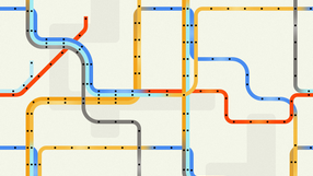
{{:docs:styling:subway_card_tile.png|}}
=== Clickable Card ===
Lorem ipsum

<btn>[[https://combostrap.com/clickable|A clickable card]]</btn>
</card>
Subway Card Tile
Clickable Card

Lorem ipsum

A clickable card


Showcase yourself and your brand

Get free news, tips, and tricks
to create a remarkable experience for your readers.


Related HowTo's
Undraw Animating
How to generate and layout a list of pages with a grid and their image?

This howto shows you how to use the page sql, a fragment, the iterator and to generate a grid layout.


Recommended Pages
Card Illustration
ComboStrap UI - Card

A card is a box composed of an image, a text and a call to action
Undraw My Documents
ComboStrap UI - Styling

Styling in ComboStrap is the possibility to render every component as you wish. ComboStrap has three levels of styling: the bootstrap stylesheet level - bootstrap standard theme the user stylesheet...
Undraw Website Builder Re Ii6e
Grid Layout: How to create a responsive space distribution on the horizontal axis

grid is a component that permits to distribute the horizontal space in a responsive fashion (ie suitable for mobile screen). The children: will go to a new line in a centered position (by default)...
Page Explorer List Name To Ui Region
Page-explorer: adding page navigation easily to your website

With the page-explorer component, you can add an explorer like panel that will list your pages in a list or collapsible tree fashion
Combostrap Link Preview
The Link component

The link component permits to create hyperlinks between pages.


Task Runner