About
image is a inline component that permits to show raster or svg images from your media library in your pages.
Features
All images:
- are lazy loaded by default to enhance performance
- are automatically reduced in size and responsive
- for svg images, we set extra responsive properties.
- for raster images, a small screen will receive a small image while a big screen will receive the biggest image. For more information, see Raster - Automatic Resizing
- support scaling on width, height or both
- are cached permanently by the server and the browser until the physical file has changed.
Supported Image Type
ComboStrap supports:
- raster image (jpg, png, …)
- and svg image
Syntax
ComboStrap uses:
- the same syntax than Dokuwiki
- extended with the possibility to define a ratio
- extended with the styling attributes
{{[ ]path?WxH&ratio=w:h&nolink&att=value[ ]}}
where:
- path is:
- for an internal image: the internal path of the dokuwiki
- for an external image: the URL.
- W is the width (Optional, 0 if you want to set only the height)
- H is the height (Optional)
- ratio is the image ratio (21:9, 16:9, 4:3, 1:1 or any other custom ratio).
- [ ] are optional spaces that indicates the alignement of the image (left, center, or right float)
- nolink will not add a link to the image itself.
- lazy=(none|html|lozad) controls the lazy method
- att=value is one or more styling attributes
Example
Resize to a given width
To resize to a given width, add a number.
Example of an image resized to 400px
{{:docs:block:stock_image_surfer_in_the_see.png?400|}}
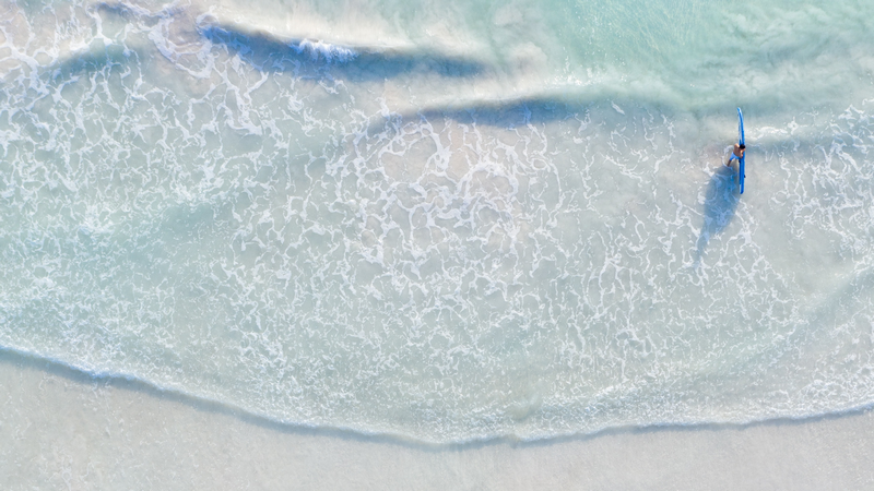
Raster images are automatically resized below the screen size. For more information, see the Raster - Automatic Resizing feature
Resize to a given height
To resize to a given height, set a width to 0 followed by the height.
Example of an image resized to 250px height
{{:docs:block:stock_image_surfer_in_the_see.png?0x250|}}
Cropping
cropping can be defined by setting the following properties:
- a width and an height
- a ratio and a width
- a ratio and a height
- a ratio
cropping works on:
- and raster image
First, the image is scaled down by height and is then cropped on the width towards the center.
Example:
- raster image cropped to 200x200px with the definition of a 200 width and 200 height
{{:docs:block:stock_image_surfer_in_the_see.png?200x200|}}
- raster image cropped to 200x200px with the definition of the ratio 1:1 and a 200 width
{{:docs:block:stock_image_surfer_in_the_see.png?200&ratio=1:1|}}
- raster image cropped to 4:3 with the definition of the ratio at the natural width
{{:docs:block:stock_image_surfer_in_the_see.png?ratio=4:3|}}
{{:undraw_content_creator.svg?0x200&ratio=16:9|}}

Position
- To position the image to the left, let no space, this is the default
- To position the image to the center with a center block, let a space at the left and at the right
- To position the image to the right with a right float, let a space at the left
Example: position the image to the right with:
- a width of 300
- and a padding of 3 (p-3) with spacing
{{ :docs:block:stock_image_surfer_in_the_see.png?300&spacing=p-3&background-color=white|}}
If you want more control on position, we advise you to use the grid and its cells.
Styling Attributes
You can style even further your image with styling element:
- with a shadow elevation through styling.
- with a hover float effect
For instance, to elevate this photography with a surfer, you could use this syntax.
{{ :docs:block:stock_image_surfer_in_the_see.png?400&onHover=float&shadow=lg |}}
Background
You can also use the image as background.
<slide color="steelblue" align="text-center" >
   <background opacity="0.3">{{:docs:block:stock_image_surfer_in_the_see.png|}}</background>
    <heading d2>A background image</heading>
    <text lead font-size="h3">A background image will emphasise a short message.</text>
</slide>
Gallery
With the carroussel component, you can create an image gallery
- The cards:
<carrousel>
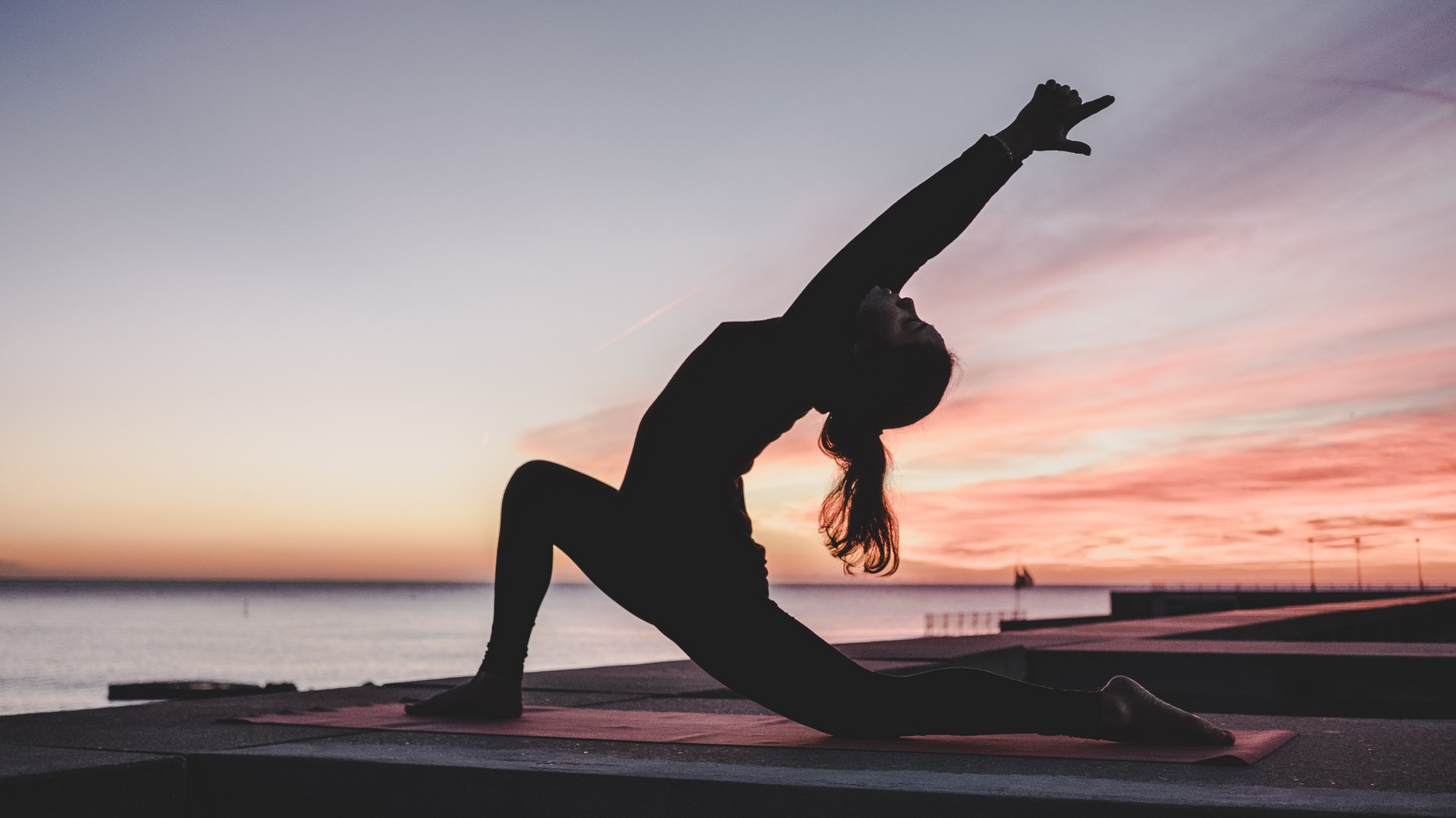
{{ :woman-yoga-sunset.jpg?0x600&ratio=16:9 |}}
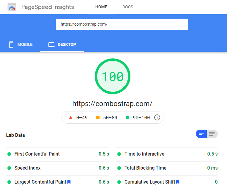
{{ :page_speed_performance.png?0x600&ratio=16:9 |}}
{{ :undraw_content_creator.svg?0x600&ratio=16:9 |}}
</carrousel>
- The output:
Support
Configuration
imageEnable
This configuration permits to disable completely this component. It will also disable:
- the raster image
- and svg component
imageDefaultLinking
This configuration permits setting the link type to the image.
| Value | Behavior |
|---|---|
| default | The default value is direct |
| direct | Direct link to the image in a lightbox |
| detail | Link to a web page with image details |
| linkonly | Only the link is displayed, not the image |
| nolink | No link is added around the image |
Metadata Image
You can also add image in the metadata in order to add/set illustrations for social cards or templates.