About
This functionality gives the possibility for Web Designers to customize the style of Combostrap components.
How it works?
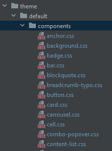
If a stylesheet with the name of a component is found in the components/css directory of a theme, it will be applied to your page.
Example for the badge component
- If there is a file name badge.css,
- If you are using the badge component on your page
- This stylesheet will be applied to that page
Component Styling Class
To ease the selection of components in order to apply a style, every component got two generated classes
name-cs
name-type-cs
where:
- name is the component name
- the suffix cs is a namespace that stands for Combostrap
- type is the component type
For instance, for a badge with the type primary, you will get the class:
badge-cs
badge-primary-cs
This classes permits selecting the component by type and applying the style accordingly.
Example
You should first create your theme
Then in the components directory
- you can create the below file badge.css to change the text color of primary badge:
badge-primary-cs{
    color: #333 !important;
}
- You can create the below file file.css to customize the file component.
code.file-cs{
    color: #333 !important;
}
pre.file-cs{
    background-color: #e9ecef !important;
}
Bootstrap stylesheet
Because by default, the style applied is the style of the bootstrap stylesheet, you may also customize them:
- by choosing another bootstrap stylesheet
- or via Css variable in a theme